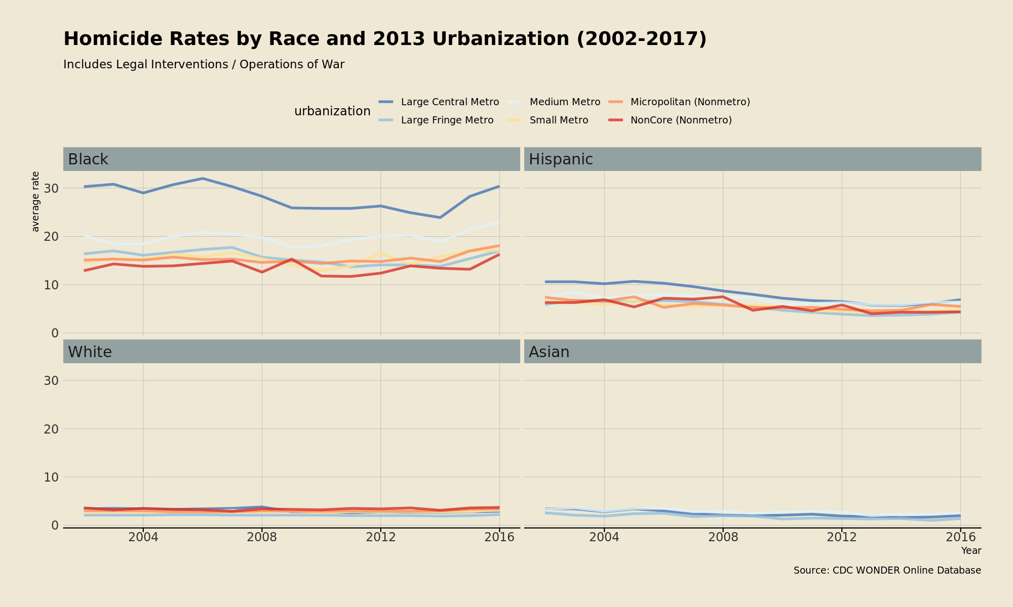
Blacks who live in urban counties tend to have the highest homicide rates; Blacks who live in rural counties tend to have the lowest. Like Blacks, Whites who lived in large metros tended to have the highest rates, but nowadays have the second the lowest homicide rates, after the suburbs.

It’s easy to tell from the chart that the Ferguson effect was worse in the major urban areas than elsewhere.
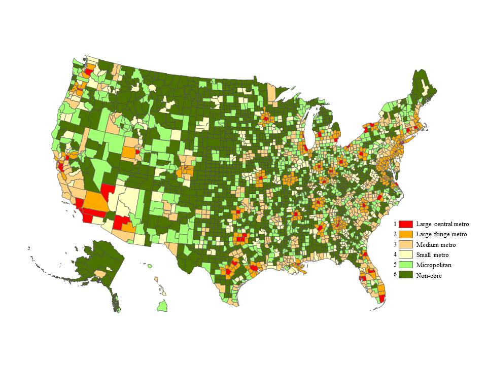
Map of urbanization by county:

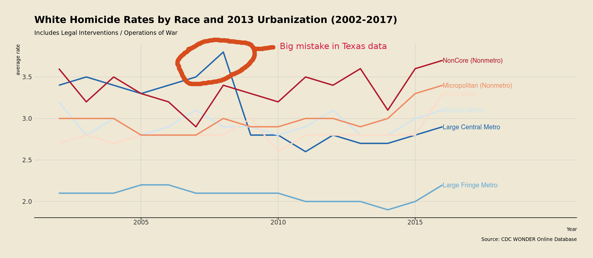
Since it’s not easy to see the White homicide patterns in the chart at the top of the page, here’s a chart that only includes Whites (if you are curious about Hispanics, there’s a chart at the bottom of this post)

Pretty telling that major metro areas used to have higher homicide
rates than rural counties, but since 2009 urban areas have become
much safer, but still not as safe as the suburbs. I wonder what
will happen now with the whole Black Lives Matter thing?
| State | Year | Homicides | Population | Rate |
| Texas | 2004 | 174 | 4,651,869 | 3.7 |
| Texas | 2005 | 164 | 4,638,099 | 3.5 |
| Texas | 2006 | 148 | 4,663,705 | 3.2 |
| Texas | 2007 | 4,668,949 | ||
| Texas | 2008 | 4,676,714 | ||
| Texas | 2009 | 4,696,335 | ||
| Texas | 2010 | 163 | 4,702,405 | 3.5 |
Non-Hispanic White Homicides and Legal Interventions in Large Central Metro Counties in Texas
| “Notes” | “Year” | “Year Code” | “Race” | “Race Code” | “Hispanic Origin” | “Hispanic Origin Code” | Deaths | Population | Crude Rate |
| “2006” | “2006” | “Black or African American” | “2054-5” | “Not Hispanic or Latino” | “2186-2” | 393 | 1716569 | 22.9 | |
| “2006” | “2006” | “White” | “2106-3” | “Not Hispanic or Latino” | “2186-2” | 148 | 4663705 | 3.2 | |
| “2007” | “2007” | “Black or African American” | “2054-5” | “Not Hispanic or Latino” | “2186-2” | 296 | 1738930 | 17.0 | |
| “2007” | “2007” | “White” | “2106-3” | “Not Hispanic or Latino” | “2186-2” | 301 | 4668949 | 6.4 | |
| “2008” | “2008” | “Black or African American” | “2054-5” | “Not Hispanic or Latino” | “2186-2” | 197 | 1771006 | 11.1 | |
| “2008” | “2008” | “White” | “2106-3” | “Not Hispanic or Latino” | “2186-2” | 487 | 4676714 | 10.4 | |
| “2009” | “2009” | “Black or African American” | “2054-5” | “Not Hispanic or Latino” | “2186-2” | 301 | 1813507 | 16.6 | |
| “2009” | “2009” | “White” | “2106-3” | “Not Hispanic or Latino” | “2186-2” | 156 | 4696335 | 3.3 | |
| “2010” | “2010” | “Black or African American” | “2054-5” | “Not Hispanic or Latino” | “2186-2” | 311 | 1843883 | 16.9 | |
| “2010” | “2010” | “White” | “2106-3” | “Not Hispanic or Latino” | “2186-2” | 163 | 4702405 | 3.5 |
Non-Hispanic Black and White Homicides and Legal Interventions in Large Central Metro Counties in Texas
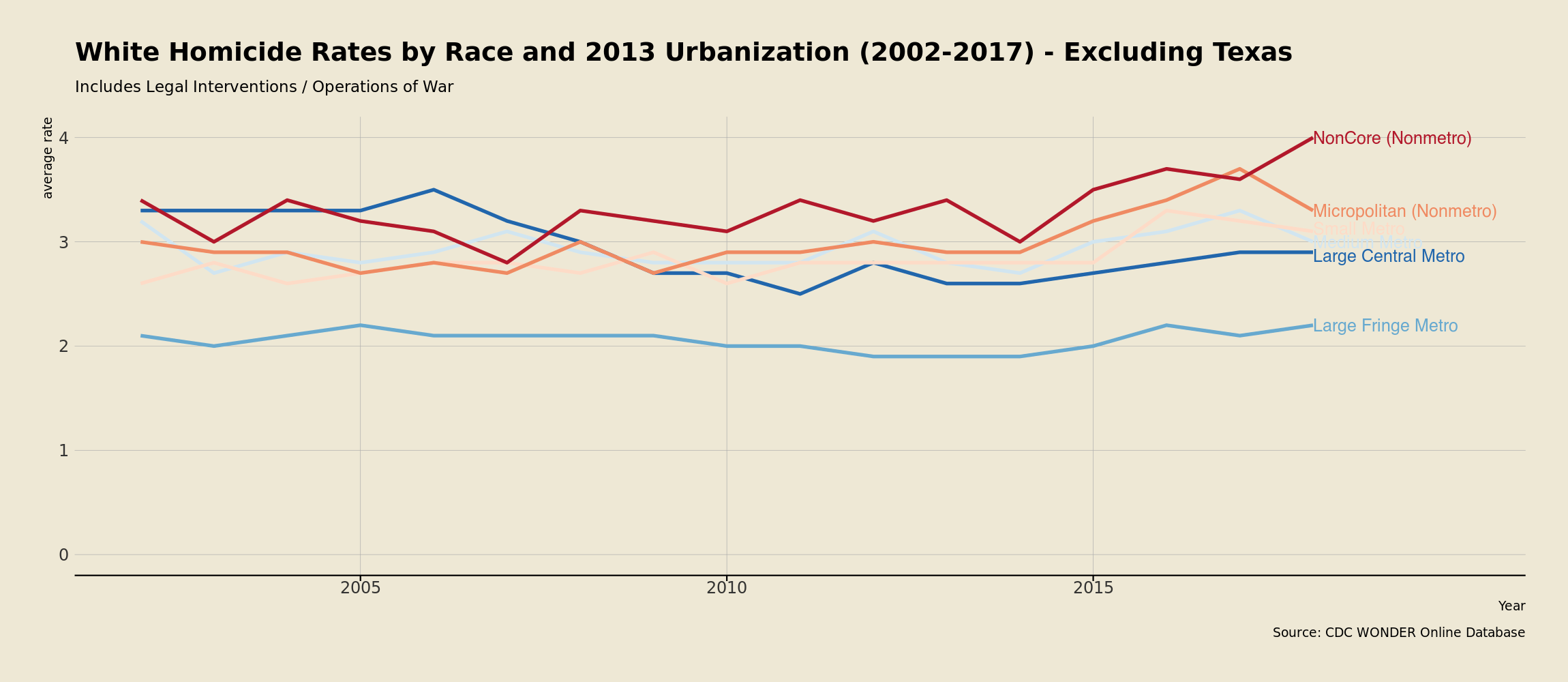
I was pretty exited about this pattern until I saw it happened in Texas and remembered my post about how the CDC screwed up the race of homicide victims in Harris county (Houston) from 2007 to 2009. When some fat dumb Texan who probably voted for that cyclops congressman transposed the racial codes in the mortality database the error was much bigger than just Houston, and that’s why it seems there was an increase and then a big decrease when people stopped misclassifying Whites as Blacks.
The data in the chart and table is wrong and the change in violence rates in large metro areas must have been much more gradual, the data at the beginning of the chart and at the end are correct: urban areas used to be relatively more violent and are now less violent, but the change was much more gradual than it appears.
