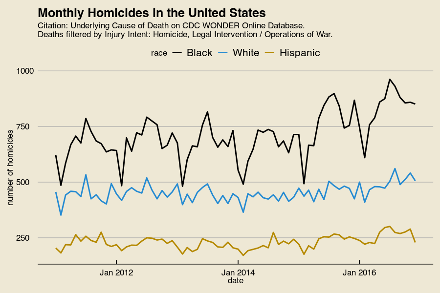
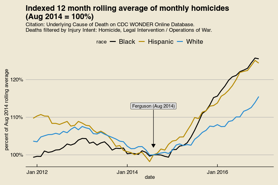
A bunch of charts and maps of where crime went up since the police shooting of Michael Brown
Blacks
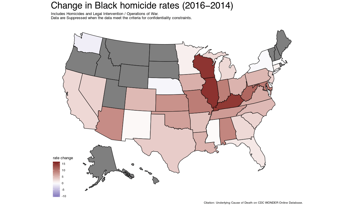
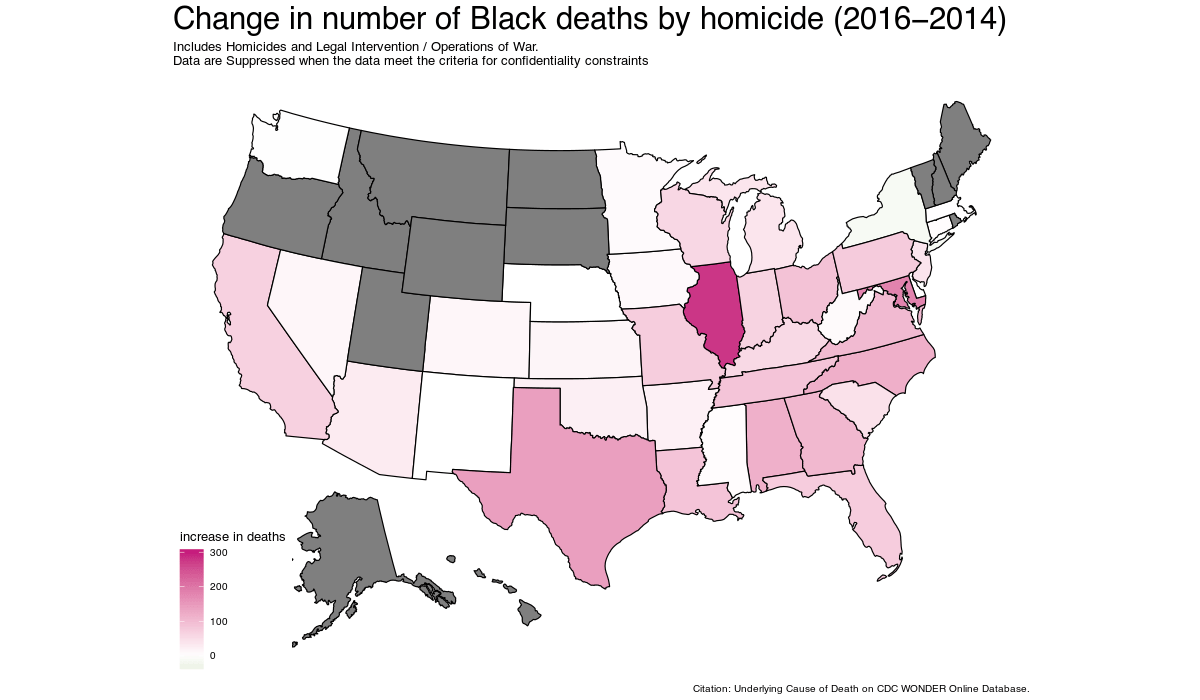
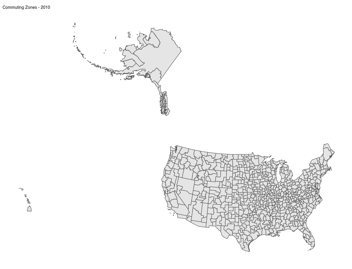
I also plotted the commuting zones with the biggest homicide increases since they cover the entirety of the United States and better capture the economic and social diversity than metro areas. Also that Indian dude that won that economics prize uses and I’ve always like the New York Times maps of his work.
| Commuting Zone | 2014 rate | 2014 deaths | 2016 rate | 2016 deaths |
| Kansas City, MO-KS | 30.4 | 59 | 54.3 | 108 |
| Louisville/Jefferson County, KY-IN | 23.4 | 41 | 44.5 | 80 |
| Milwaukee-Waukesha-West Allis, WI | 28.2 | 80 | 46.9 | 133 |
| Chicago-Naperville-Elgin, IL-IN-WI | 29.9 | 455 | 48.5 | 732 |
| Dayton, OH | 20.0 | 30 | 38.4 | 58 |
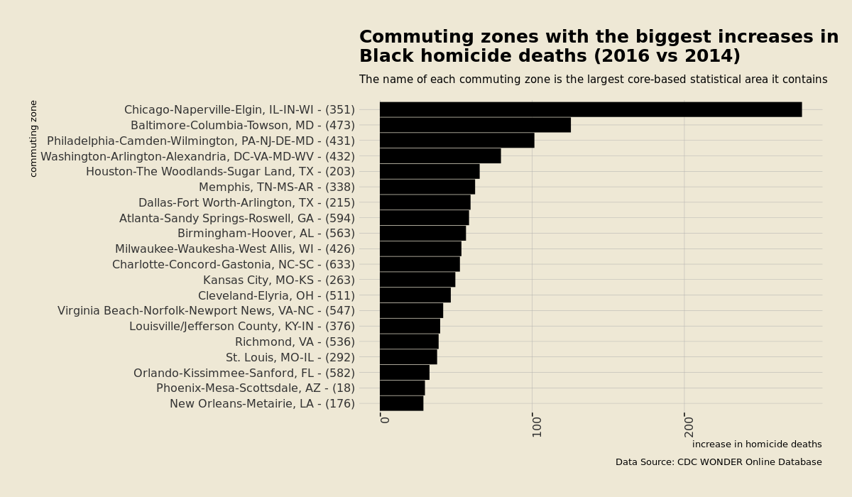
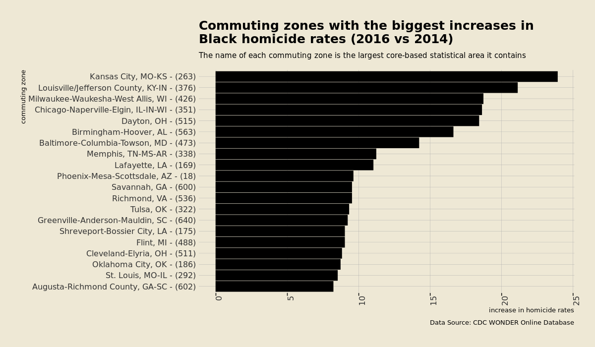
Guatemala had a homicide rate of 28 in 2019, so the Kansas City commuting zone had a rise in homicide rate of close to one Guatemala
Why Trump won Ohio and Wisconsin.
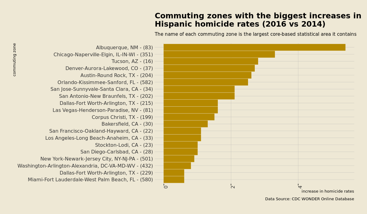
Hispanics
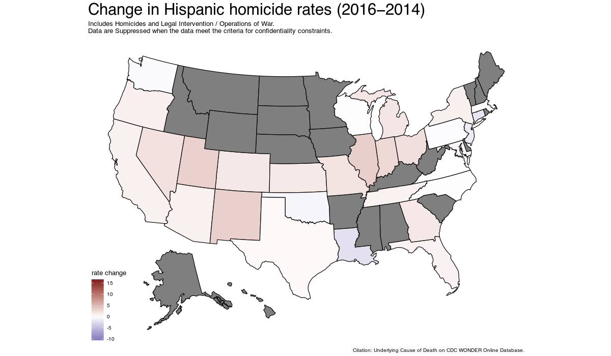
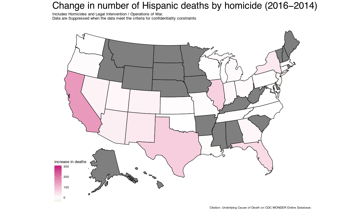
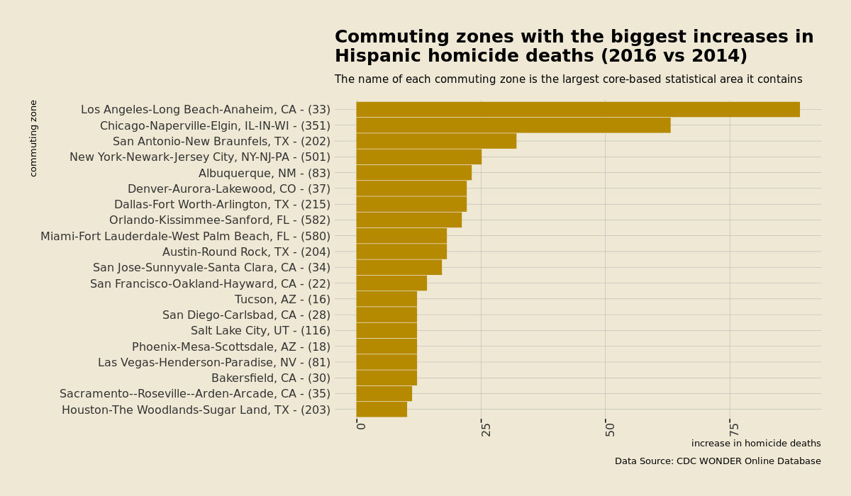
| Commuting Zone | 2014 rate | 2014 deaths | 2016 rate | 2016 deaths |
| Albuquerque, NM | 7.3 | 30 | 12.7 | 53 |
| Chicago-Naperville-Elgin, IL-IN-WI | 5.1 | 93 | 8.4 | 156 |
| Tucson, AZ | 6.6 | 27 | 9.4 | 39 |
| Denver-Aurora-Lakewood, CO | 4.8 | 34 | 7.5 | 56 |
| Austin-Round Rock, TX | 3.9 | 23 | 6.5 | 41 |
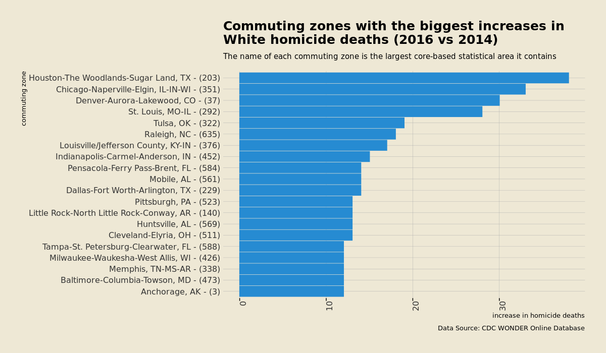
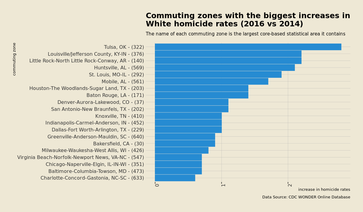
Whites
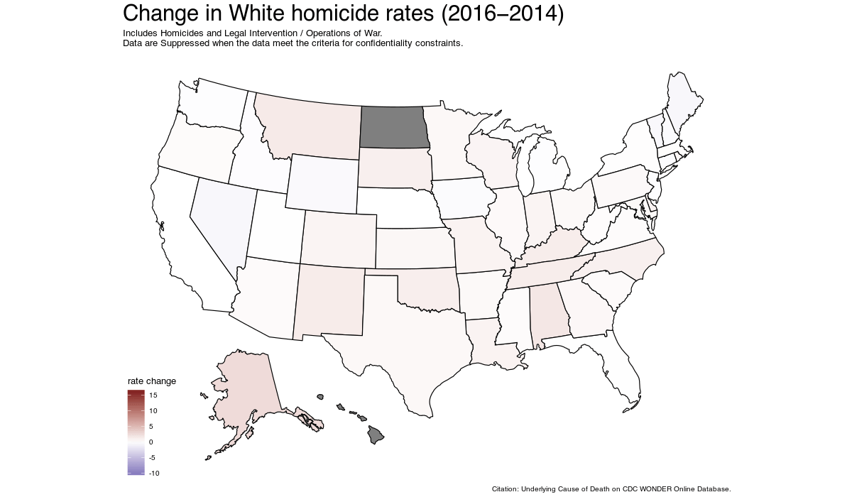
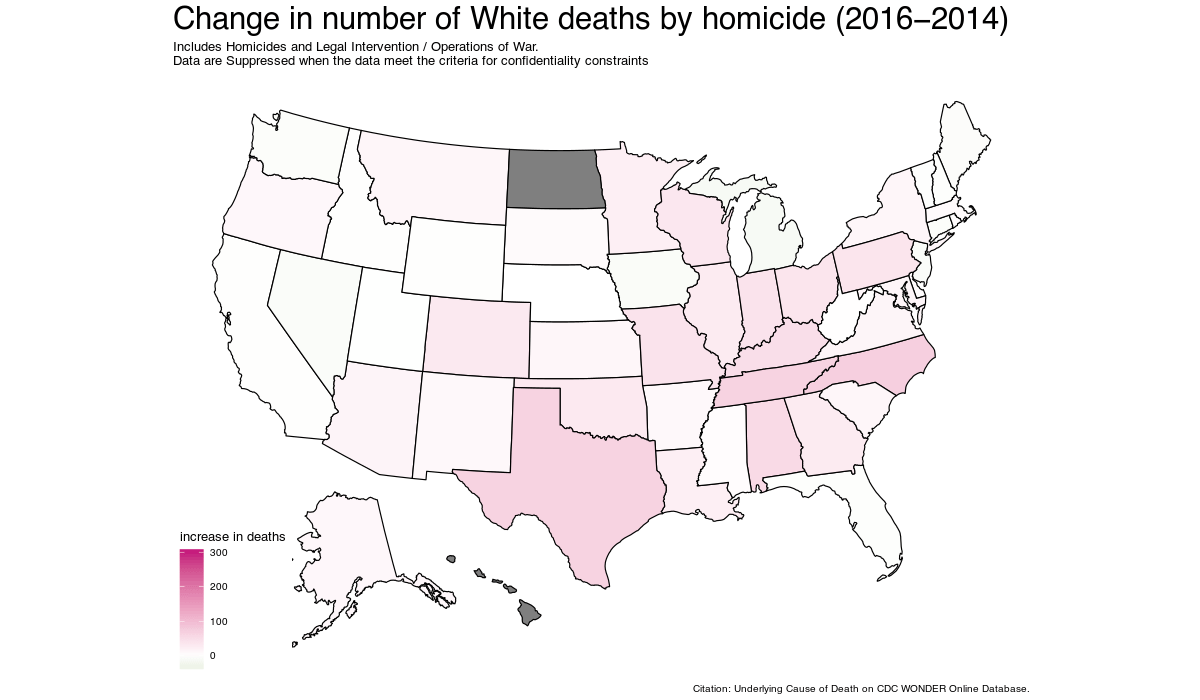
| Commuting Zone | 2014 rate | 2014 deaths | 2016 rate | 2016 deaths |
| Tulsa, OK | 3.8 | 26 | 6.6 | 45 |
| Little Rock-North Little Rock-Conway, AR | 5.2 | 31 | 7.4 | 44 |
| Louisville/Jefferson County, KY-IN | 3.5 | 26 | 5.7 | 43 |
| Huntsville, AL | 3.7 | 22 | 5.8 | 35 |
| St. Louis, MO-IL | 1.9 | 28 | 3.8 | 56 |
St. Louis in 2014 had a homicide rate similar to that of London in 2018 and now it is significantly higher.
